It is by the logo that many will recognize famous brand. For some, the history of logo creation is mysterious, while for others, everything was simple and clear. Some of them have changed, some have never changed.
The founder of this brand, Rene Lacoste was once one of the best and most famous tennis players in the world. There are several versions of why it was nicknamed "alligator" (later changed to "crocodile"). The first version, because of his behavior on the court, that he, like no one else, managed to wear down his opponent on the court.
Founder of the Lacoste clothing brand, Rene Lacoste. 
The second version, and it is more common, is that he made a bet that he would win a certain match. There was a bet, a suitcase made of crocodile (or alligator) skin. Later, his friend, Robert George, drew a crocodile for him, which was embroidered on his blazer, in which he began to perform, and which later became the company logo.

John Warnock and Charles Geschke left Xerox to form their own manufacturing company. software. And they named the company after Adobe Creek, which flows in California.
Founders John Warnock and Charles Geschke. 

“I’ll call Apple if you don’t come up with something better by 5 o’clock.”
I think everyone knows very well that the apple was the favorite fruit of the company founder, Steve Jobs. Initially, the creators wanted to play on the legend known to every schoolchild about the apple that fell on Newton’s head, which allowed him to discover the law of universal gravitation. But the logo was cumbersome, and later the “bitten apple” logo appeared. But why, is it bitten? There are many versions, one is that Steve wanted the company to be associated with an apple, which Adam once could not resist, i.e. and you will not resist the products of this company; another, due to the similarity of the English words “byte” (“byte”) and “bite” (“bite”).
Founder Steve Jobs. 
The company's first logo. 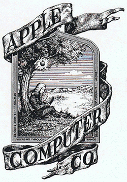
But there is another version that this is an allusion to the suicide of Alan Turing, a scientist who had a huge influence on the development of computer science and computer technology. He was gay, in 1953 he was accused of homosexual relations, and according to a court order he was given the choice of two sentences: imprisonment or suppressing his libido with estrogen injections. He chose the latter, and there is a version that in 1954 he committed suicide by biting into a poisoned apple soaked in cyanide, unable to withstand the persecution of society.

In 1958, Enrique Bernat created the first lollipop (wooden at the time) that could be sucked without getting your hands dirty. And the logo itself was drawn by the famous artist Salvador Dali, and it was he who suggested placing the logo not on the side, but in the center.
Founder Enrique Bernat. 
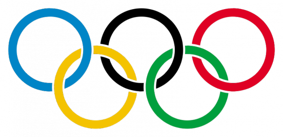
Five multi-colored rings connected together were invented by Pierre de Coubertin; it was he who revived the Olympic Games, which took place in the summer of 1896. But the rings were invented in 1913 (according to some references in 1912), and introduced in 1920. The most common version is that the rings represent the five parts of the world whose countries participate in the Olympic Games: America - red, Asia - yellow, Africa - black, Australia - green and Europe - blue. Including the white color of the canvas, they represent the colors that are found in all flags of the world.
Pierre de Coubertin. ![]()
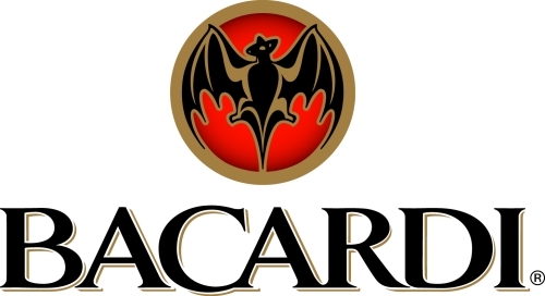
In 1862, Cuban wine merchant Facundo Bacardi and his brother José bought a distillery in Santiago de Cuba, under the roof of which lived many fruit bats. In Cuba, the fruit bat is a symbol of good luck, so Facundo decided to take the image of this mouse as the company logo.
Founder Facundo Bacardi. 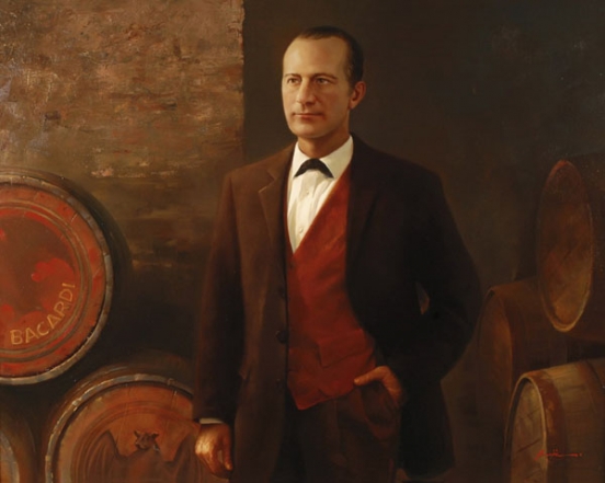
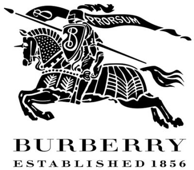
The company logo is a horseman in armor and holding a spear in his hand. The spear represents the symbol of defense of tradition, and the Latin word "Prorsum", translated as "Forward", reflects the company's desire for progressive innovation.
Founder Thomas Burberry. 

The Italian company was founded by the Greek Sotirio Bulgaris, and in modern Greek his surname was written as Bvlgaris. The last letter was abandoned, and it became Bvlgari.
Founder Sotirio Bulgaris. 
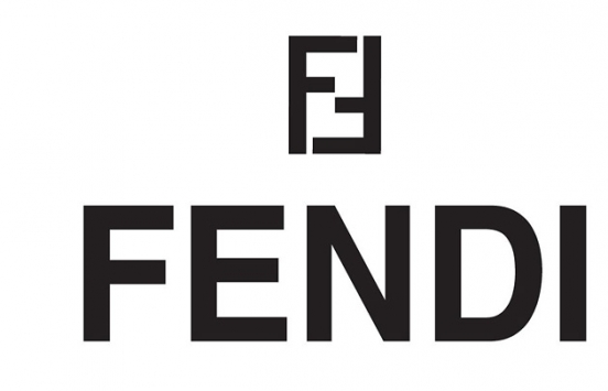
In 1962, the famous designer Karl Lagerfeld created no less famous logo fashion house Fendi. The double “F” symbolizes the Fendi couple who created the fashion house.
Spouses Eduardo and Adele Fendi. 

There are several versions of the logo of the Chanel fashion house. One of them, that two crossed horseshoes, denotes a symbol of good luck and success. Another version, which everyone is more inclined to believe, is that these are the initials of Coco Chanel, which she drew before opening her first mono-brand store.
Founder of the fashion house Coco Chanel. 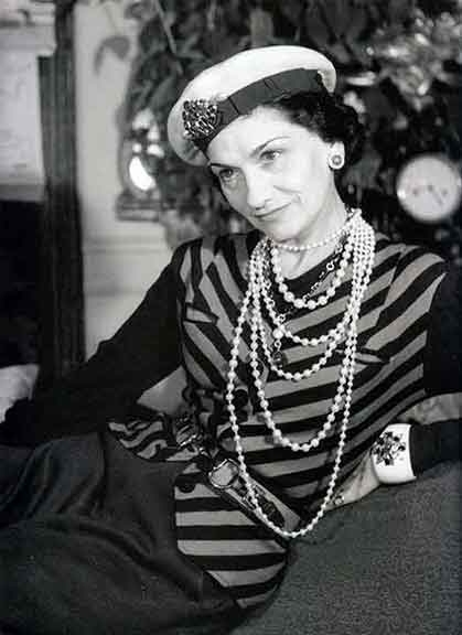

The logo of the 70-degree German digestif is based on a very old tale about St. Hubert, the patron saint of hunters. The tale tells how Hubert broke the ban on hunting and met a deer, which turned around and a cross shone between its antlers. The animal forgave Hubert and then he became a saint.

The Prancing Horse first appeared not on a car, but on a military aircraft flown by Francesco Baraca, an aviator and hero of the First World War. In 1923, Enzo met Francesco's parents, and it was they who suggested that he use the image of a prancing horse on his racing car, for good luck and in memory of Francesco, who died shortly before the end of the war. Enzo added a yellow background, the official color of his hometown of Modena, and pointed the tail upward. The triangular shield emblem is used by the Italian racing team; and a rectangular emblem, a sign of the Ferrari company plant.
Founder Enzo Ferrari. 

The emblem was invented by Gianni Versace himself in 1978. According to the idea, the head of the Gorgon Medusa symbolizes that Gianni turns viewers into stone with his collections. It was she who he considered “the embodiment of fatal attraction.”
Founder Gianni Versace 
In 1930 in Japan, Goro Yoshida and his half-brother Saburo Uchida created a company under the name "Precision Optical Instruments Laboratory in Japan". Four years later they created their first 35mm camera, which they named Kwanon, after the Buddhist deity of mercy, and registered a bunch of words similar in sound to Kwanon to protect their trademark. One of which was Canon.

The company's history dates back to 1837, when Thierry Hermès founded a company producing harnesses and bridles for horses, which is why the company logo depicts a horse and cart. Today the company is known for its leather bags, which are processed with a special “saddle” seam.
Founder of Thierry Hermès. 
Volvo is Latin for "I roll", and originally this trademark has been registered for a special series of ball bearings. The logo means an antique symbol of iron, representing a circle with an arrow. In the Roman Empire, this sign personified the warlike and invincible god Mars, who fought only with iron weapons.
Founders Assar Gabrielson and Gustaf Larson. 

Everyone knows what the SK logo means, but not everyone knows that the dark-colored emblem is used only on High Fashion clothing, the gray emblem is on regular clothing items, and the white one is used for sportswear. But it seems that the white emblem is going to be abolished.
Founder Calvin Klein. 

Phew, this playful hare is known to everyone, but for some reason, many people think that it is a rabbit. But it was the hare in a bow tie that was drawn for Hugh Hefner, because it is he who Hugh considers funny, playful and at the same time very sexy.
Choosing a color combination for a logo may not seem like the most difficult task in the world, but if you do it wrong, it will have a detrimental effect on the design. Experimenting with color combinations is one of the ways to create a logo. Below are some tips to help you avoid making mistakes.
Why is color so important?
A good color palette is the finishing touch to a good design and can make good logo great. Logo color scheme– this is what makes it special and recognizable. Choosing the right logo color will help people remember your brand.
The effect of flowers in logo design.
Colors in logo design and the brand in general, can evoke strong emotions in customers, which will make them want to buy your products and use your services.
As we already wrote in - different colors and their combinations evoke different internal sensations in people.
So if you attach meaning to the color of the logo, you will be able to subconsciously influence people and their choices.
How many colors should I use?
If you take a closer look at the most popular and “big” modern brands, you will notice that they use only 2-3 colors in their logos. Despite the fact that the third is usually used as a shade, and the other 2 are “main” brand colors.
Generally, it is best not to use more than 3 colors in a logo design, usually due to the fact that a large number of colors can make the logo design too complex. Always remember that the logo should look just as good in black and white as it does in color.
HARD CHOICE OR INTUITIVE GUESS
FIND YOUR FAVORITE COLOR AND FIND OUT WHO YOU REALLY ARE!
DECODING THE INFLUENCE OF DIFFERENT COLORS ON OUR CONSCIOUSNESS, AS WELL AS PSYCHOLOGICAL CHARACTERISTICS OF “COLOR AND CHARACTER”:
RED.
"RED CHARACTER"
You have courage and are very active in social settings. Cheerful but changeable, you quickly replenish expended energy. In business, people are prone to extraordinary actions, making decisions here and now.
Characteristics of color: Excites, activates, and sometimes evokes aggressive emotions. With prolonged exposure, doctors note an increase in heart rate and breathing. True, this effect is short-lived: fatigue soon sets in, the consequence of which is a depressed state. However, red remains an unsurpassed symbol of activity, movement, life. Red has the strongest influence on the consumer.
ORANGE.
"ORANGE CHARACTER"
You have very developed intuition, you are a cheerful person, you are the center of attention. In conflict situations, they are capable of pretense and hypocrisy, but solely for the sake of preventing disagreements. They can easily cheer up a loved one. You make a choice easily, “the toad is strangling” - this is not about you. Color Specification: Tone Have a good mood, fun and vivacity. Increases performance. Well suited as a color of communication and relationship. YELLOW. “YELLOW CHARACTER” You are open and ready to communicate at any moment, you are witty - you can appreciate a good joke and joke back, you are an artistic and victory-minded person. You are a creative person who knows what he needs.
Color characteristics: Active, invigorating. Evokes associations with sunlight.
GREEN.
"GREEN CHARACTER"
You are able to adapt to circumstances on the fly, are capable of compassion and are slightly sentimental, but strong in spirit. Confident in yourself. In controversial situations, do not back down. They are open to people and ready to help. In love with real things and great goals.
Color characteristics: Soothing. On it, as many put it, “the eye rests.” Increases performance and gives a feeling of confidence.
BLUE AND CYAN.
"HEAVENLY CHARACTER" You love what you do, you are independent, but you also value teamwork. You are balanced and empathetic. A self-confident person with a rich spiritual world. They are reasonable and calm, capable of moving towards their goal, thinking through every step, while laying a solid foundation for any business.
Characteristics of the color: In terms of their effect on a person’s emotional state, they are very similar to green: they soothe, relieve tension, induce confidence and tranquility.
VIOLET.
"PURPLE CHARACTER"
Is everything purple for you? Perhaps, but you express indifference only to those things that are indifferent to you. You are a subtle creative soul with a rich imagination, artistic and poetic. You know how to turn your fantasies into reality.
Color characteristics: Reduces activity. Long-term exposure may cause anxiety and depression.
BROWN.
"BROWN CHARACTER"
You stand firmly on your feet, you know how and where to go towards your goal. You solve practical issues with ease. You are honest with people and with yourself. You are not inclined to “show off” or appear better than you really are. You always know what you're doing.
Color Characteristics: Warm and calm. His emotions are restraint, confidence and even some melancholy.
GRAY AND BLACK.
"DARK CHARACTER" You are a person of dignity, full of inner strength, calm and inspiring respect without false pride. You are a loner and slightly secretive, this is your style of action.
Characteristics of color: When they differentiate other colors, the perception is neutral. If there are many of them, they oppress.
WHITE.
"WHITE CHARACTER"
You are precise and careful in your actions, calculating and somewhat cold, you live by your own rules. You have a unique property - “purity” of thought.
Color characteristics: Symbol of purity. The perception is certainly positive, but when there is a lot of it, a feeling of sterility, lifelessness, and absence may arise.
COLOR PERCEPTION.
Have you ever wondered why a walk through a green forest evokes a feeling of calm and tranquility, but a long stay in a room with a predominance of red in the interior awakens irritation? Why does contemplation of the blue sky relax and calm, and being on a sandy sea beach gives you vigor? It's not just about fresh air or the lack thereof: our emotional background is greatly influenced by the colors that we observe. Color in a logo is extremely important for human perception, you need to take this into account when creating a logo.
The mechanism of this effect has not been fully studied, and therefore we will not talk about assumptions. However, the fact remains: green calms and puts you in a contemplative mood, the abundance of black makes you despondent, and yellow invigorates and increases efficiency. Psychologists have long “deciphered” the effect of different colors on the human condition, and such disciplines as color psychology and color therapy have been introduced into scientific circulation. And, of course, this knowledge was adopted by advertising specialists.
The way you paint the logo, the company will float...
This paraphrase of Captain Vrungel’s famous statement about the connection between the name of a ship and its destiny is 100 percent correct: after all, the first visual information about the company that potential clients and partners receive is the logo. Your products or services can be as good as you like, and your employees can be super professional - a person will not know about it, because he will not contact you. And they will not contact because of the unconscious repulsive impression that the logo made on them. Of course, you shouldn’t hang all dogs on it: even if the logo is impeccable from the point of view of advertising art, but the office is a complete mess and plaster is falling from the ceiling, it’s unlikely that anyone will trust your company. However, I think you understand what I mean...
Before you understand how a particular color affects society, you need to look at where it is used, and then making a choice in favor of any color can be made much easier.

Business colors
So, the next thing on the agenda is choosing the right color in the logo. Which shades are right for your business? There are two choices here. The first one is direct. It is suitable when the company’s activity profile is directly related to any color. For example, if you are engaged in air or sea transportation, blue and cyan colors are ideal, and for wood processing - green. However, a “profile” color is not always appropriate: if a company provides funeral services, you should not make a black logo. People are already sad, so when they see a depressing black logo, they will simply shy away from your company. It is much better to make a logo using blue or green tones - they will instill calm and hope in your potential clients on a subconscious level.
Imperceptibly, I have already moved on to the second method of selecting colors for a logo: associative. When it comes to banking services, you need a feeling of confidence and reliability, which shades of blue give. Yellow, a “sunny” color, is perfect for travel agencies. The combination of white and green (cleanliness + calm and confidence) - for companies providing medical services. Do you want to motivate an immediate purchase? Energetic colors are suitable: red (but not too large quantities), orange, silver.
Let's look at the combination of colors in the logos of famous companies: adopting successful experiences is always useful. Pepsi: blue, white and red. Calmness and confidence, purity and energy. "Ford" and "Volkswagen": white letters on a blue background. Confidence and reliability are exactly the qualities that a car requires. “Google” is a seemingly crazy combination of colors: blue, red, yellow, green. And from the point of view of color psychology, there is reliability, confidence in the result, and motivation to action.
To summarize: when developing a logo, you first need to understand what emotions we want to evoke in a potential buyer. This is what you should take as a starting point when choosing a color.
Symbol language
In a logo, not only color matters, but also symbols. The perception of certain symbols in our subconscious has been genetically fixed since ancient times. Their competent combination with well-chosen colors will unconsciously attract people to you.
Let's try to speak a little symbolic language.
Ring (circle)- a symbol of infinity, love and fidelity, the eternity of life. In combination with an energetic color - for example, silver - an active incentive to action, the results of which can be certain. A striking example is the Audi logo.
Tree- strength, force of nature. The combination with green color symbolizes a calm, kind force that you can trust.
Eagle (bird)- courage, intelligence, authority. The black eagle is repulsive - it gives the impression of evil, oppressive power. But a silver or golden bird is completely different: it is already an energetic and kind force, a protector.
Rook or ship- hope, joy, good news. The symbol itself is very powerful, and if you apply energetic colors to it - red or orange - you can overdo it. And in combination with calm colors - blue, indigo, green - the rook evokes a feeling of confidence, an understanding that all changes are for the better.
The meaning of colors and symbols and their application to logo design can be considered endlessly. I set myself another task: to show that a logo cannot be created based solely on one’s own sense of style. First we need to understand what we want to achieve - and only then get to work.
If you have chosen a monochrome logo, then its color is what first catches the consumer’s eye. Therefore, in order to immediately and clearly indicate the type of activity of your company and make your logo as effective as possible, you need to choose the right logo color.
The color of the logo, along with its shape, instantly transmits the impulse characterizing the nature of the image into our subconscious. This is one of the most powerful non-verbal tools to use when designing a logo. Our perception reacts very actively to color, and the received signals form some images.
An example of this is the fact that, for example, when we see a red traffic light, we stand, and the green traffic light conveys to the subconscious that the danger has passed and we can go. Similarly, in nature, green conveys calmness, and red conveys a feeling of anxiety. Thus, color not only accompanies us everywhere, but also has great significance in our daily lives.
For Logozila designers, the color used is very important when designing a logo. Before choosing a color for a logo, our designers pay attention to where it is found in nature, where it is used, and then they will make a choice in favor of any color.
Let's look at the colors that are most popular in the development of monochrome logos using examples of famous brands.
Red color.
The color red is associated with: blood, danger, drive, energy, excitement, love, passion, strength, energy.
The color red has perhaps the strongest impact on the consumer’s psyche. It promotes increased activity, greater confidence and friendliness. But red can also be very irritating and cause feelings of anxiety or panic, depending on the intensity of the hue used in the logo.
Green color.
Green color is associated with: money, nature, well-being, health, freshness, fidelity, environmental friendliness.
This color is considered relaxing to the eyes and the color of nature, as well as peace and harmony. The dark green color of the logo is very popular among financial and banking companies. Light, olive color is suitable for use in promoting natural, healthy products.
Blue and cyan colors.
These colors are associated with: calm, confidence, dignity, power, success, security, nobility.
Blue is probably the most popular logo color. Represents peace and tranquility, devotion and fidelity, harmony, trust and confidence. This color is ideal as the main color of a logo, which conveys purity and a positive mood.
Yellow.
Associations for the color yellow: attention, fun, curiosity, happiness, joy, play, positive, light, warmth.
When used in combination with red, you get a strong, eye-catching color scheme (like Shell). Rich light yellow represents dignity, honor and loyalty. This color of the logo really attracts the attention of children, so it is used in various toys and children's goodies.
Orange color.
Orange color associations: creativity, enthusiasm, fun, carefree, youth, health.
![]()
This color creates an atmosphere of fun, joy, and encourages action. Orange is a combination of red and yellow. Effective for promoting health-related products, various drinks, toys and other products for young people.
Purple.
Associations: ceremony, high cost, fantasy, mysticism, sophistication, spirituality, intelligence, sadness, grief, mystery, truth.
This color is not often used by designers in logos. Since purple is a combination of red and blue, it has both warm and cool properties. The color purple can be used in many logos related to education, luxury goods or entertainment, nightlife, restaurants.
Pink color.
Associations: tenderness, femininity, floral, girlish, gratitude, innocence, romance, softness, peace.
![]()
Effective as a primary or secondary color for a logo when promoting products for women, such as exclusive products for women, spas, cosmetics, lingerie and perfumes.
And finally, black color.
Associations: classic, conservatism, formality, mysticism, mystery, traditionality, order, power, authority, elegance.

Perhaps the most common color that looks solid and reliable in logos. Black pairs well with most other colors and is often used by designers for two-tone signs and logos.
Every day we see a lot of graphics, logos and symbols with a wide variety of color combinations. The same logos can change their meaning if you change their color. Different color combinations can stimulate or inhibit, add energy or cause a depressed mood, help attract or distract attention. The colors used in the logo are of great importance in shaping its perception and, of course, allow you to fully use the potential of the brand name. That is why logo development should be carried out by professionals who can take into account every detail. It is very important to connect the incentives that arise when you see the color scheme of the logo and the company’s activities. For example, a company producing GPS navigators should have a different color scheme than one engaged in financial services.
You shouldn’t skimp on logo development by entrusting this task to random people.
What associations do people have when they see certain colors and what color should you choose for your company logo?
Red – this color evokes a feeling of warmth, it is also called the “color of fire.” It is the color of life, attracting attention due to its visibility and having a stimulating effect. Suitable for signs that require association with warmth, energy and vitality.
Orange is another color from the “fire colors” palette. It is associated with joy and causes extroversion. This color attracts people, positively stimulates them and motivates them to action. Because of these characteristics, orange is best suited to create symbols associated with dynamic, happy, positive and active actions.
Yellow is the brightest of the “colors of fire” and is associated with the sun and warmth. Thus, it is a symbol of the sun and is indispensable for travel agency logos. The yellow color perfectly reflects the optimistic nature of the logo. Since this color is very bright, it should be presented against a dark background to increase the contrast of the logo.
Gold is the color of luxury, wealth, associated with the ideas of prosperity, stability, peace and trust. If the logo needs to express such characteristics of the company, then this color will be ideal, especially in combination with gray and brown tones. These color combinations evoke a feeling of peace, security and sustainability.
White is the color of snow, reminiscent of pristine purity. It calms, pacifies and improves mood. This color works better against a dark background. The combination with blue shades enhances the impression of purity. This combination of colors is necessary if we want to convey to the viewer the impression of cleanliness and hygiene. This is the reason why most dental or medical companies use both of these colors for their logos and emblems.
Pink is a color that has a positive and strong effect primarily on women or children. This color evokes feelings of weakness, sensitivity and romanticism. Also evokes sympathy and is associated with good melodies. As such, it seems an obvious choice when designing the symbols of "female" businesses - from beauty salons to "gossip" portals about celebrities, artists and the like.
Purple is a combination of pink (or red) and blue. Just like pink, it is associated with femininity, but does not have the infantile connotation that pink has. With an admixture of blue tint, the color violet evokes associations of something serious, calm, and dignified. Emphasizes ideas of weakness, peace, security and dignity.
Blue is a color from the palette opposite to the “colors of fire”; it is called “watercolor”. Most often, blue is associated with water and sky. The color is cool, relaxing, calming, stimulating to work. Promotes a feeling of cleanliness and space. The color is undoubtedly the leading color in logos related to business and medicine.
Green - just like blue, refers to “watercolor”. Reminiscent of nature, appears in almost all sites related to nature, environment, tourism and forestry. Reminds of peace, relaxation, calms, improves mood, gives optimistic, peaceful energy. Green symbols are also used in projects dedicated to military, sports and outdoor activities.
Brown is the color of the earth palette. The color of safety and warmth, radiates peace and harmony. Recommended for companies that want to have an image associated with a sense of stability and security in life. In combination with green color it will reflect the ideas of ecology, harmonious relationships with nature, with golden shades it expresses dignity, control and balance.
Black is often used in everyday speech as a “negative” color. This color is characterized by such qualities as dignity and sadness. Although black is also associated with magic and mysticism, at night. In combination with white, it sets it off, creating a strong contrast. When designing any logo, you need to take into account the creation of its black and white version. For this reason, before committing to the final shape of a symbol, you should first check how it will look in black and white.
Health supply is an significant part of leading a wholesome lifestyle. But can drugs help us? Some medicines are pops. Other works for racy maladies like Autoimmune hemolytic anemia. Like all other medications, Viagra is classified according to it’s active ingredient. Learn more about “when does Viagra go generic.” When you buy medicines like Viagra you should remember about “viagra patent expire “. Matters, like “when does Viagra go off patent “, refer to variant types of soundness problems. Erectile dysfunction can be a result of a bodily state. Even when it has a bodily cause, mental soundness condition can make the problem worse. Prescription remedies can help us, but they can also come with dangerous side effects. It’s substantial to think that not all medications are good for you. The so first aspect you have to check that when you purchase medicines like Viagra online, you get real preparation. Many of the sites offer really hazardous fakes.