LABORATORY WORK No. 1
Study of contact properties of semiconductors n- And p- type with the same band gap
Brief theoretical information
The main element of the majority semiconductor devices is an electron-hole transition ( р-n-junction), which is a transition layer between two regions of a semiconductor, one of which has electronic conductivity, and the other has hole conductivity.
Education p-n -transition. P-n -transition in an equilibrium state.
Let's take a closer look at the education process p-n-transition. The transition state is called equilibrium when there is no external voltage. Let us recall that in R -region there are two types of main charge carriers: stationary negatively charged ions of acceptor impurity atoms and free positively charged holes; and in n-region there are also two types of main charge carriers: stationary positively charged ions of donor impurity atoms and free negatively charged electrons.
Before contact p- And n- areas, electrons, holes and impurity ions are distributed evenly. Upon contact at the border p- And n- areas, a concentration gradient of free charge carriers arises and, as a result, diffusion. Under the influence of diffusion, electrons from n-areas go to p-region and recombine there with holes. Holes from R-areas go to n-region and recombine there with electrons. As a result of this movement of free charge carriers in the border region, their concentration decreases almost to zero and, at the same time, p-region, a negative spatial charge of acceptor impurity ions is formed, and in n-region has a positive spatial charge of donor impurity ions. A contact potential difference arises between these charges j to and electric field ETo, which prevents the diffusion of free charge carriers from deep R- And n- areas across p-n- transition. Thus, the region depleted of free charge carriers with their electric field is called p-n- transition.
P-n-transition is characterized by two main parameters:
Potential barrier height. It is equal to the contact potential difference j to. This is the potential difference in the junction caused by the charge carrier concentration gradient. This is the energy that a free charge must have in order to overcome the potential barrier:
Where k– Boltzmann constant, q– electron charge, T- temperature, N a And N d– concentrations of acceptors and donors in the hole and electron regions, respectively, p p And p n– concentration of holes in p- And n- areas, respectively, n i – the intrinsic concentration of charge carriers in an undoped semiconductor is the temperature potential. At a temperature T = 27 0 C jT ≈ 0.025 V, for germanium junction jTo= 0.6 V, for silicon junction jTo= 0.8 V.
pn junction width(Fig. 1.1) is a border region depleted of charge carriers, which is located in p- And n-regions
Where e- relative dielectric constant of the semiconductor material, ε 0 - dielectric constant of free space.
The thickness of electron-hole transitions is of the order (0.1 - 10) µm. If p-n-transition is called symmetric if >< , то < > And p-n- the transition is called asymmetric, and it is mainly located in the region of the semiconductor with a lower impurity concentration.
In an equilibrium state (without external voltage) through р-n-transition, two counter flows of charges move (two currents flow). These are the drift current of minority charge carriers and the diffusion current, which is associated with the majority charge carriers. Since there is no external voltage and there is no current in the external circuit, the drift current and diffusion current are mutually balanced and the resulting current is zero:
This relationship is called the condition of dynamic equilibrium of the processes of diffusion and drift in an isolated (equilibrium) p-n-transition.
Surface on which contact p- And n-area is called the metallurgical boundary. In reality it has a finite thickness - δ m. If δ m<< , That p-n- the transition is called abrupt. If δ m>> then p-n- the transition is called smooth.
Р-n-transition in a nonequilibrium state (with an external voltage applied to it).
External voltage disrupts the dynamic balance of currents in p-n-transition . P-n - the transition goes into a nonequilibrium state. Depending on the polarity of the voltage applied to the areas in p-n-transition, two operating modes are possible.
Forward offsetp-n -transition. P-n- The junction is considered to be forward biased if the positive pole of the power supply is connected to R-area, and negative to n-areas (Fig. 1.2)
With forward bias, voltage j to And U directed counter, the resulting voltage on p-n-transition decreases to the value jTo - U. This leads to the fact that the electric field strength decreases and the process of diffusion of the main charge carriers resumes. In addition, forward offset reduces the width p-n-transition, because . The diffusion current, the current of the majority charge carriers, becomes much larger than the drift current. Through p-n- junction direct current flows:
When direct current flows, the main charge carriers R-areas go to n-area where they become non-core. The diffusion process of introducing majority charge carriers into a region where they become minority carriers is called injection, and the direct current is a diffusion current or an injection current. To compensate for minority charge carriers accumulating in p- And n- areas in the external circuit, an electronic current arises from the voltage source, i.e. the principle of electrical neutrality is preserved.
When increasing U the current increases sharply, the temperature potential, and can reach large values because associated with the main carriers, the concentration of which is high.
Reverse bias p-n -transition occurs when p-a minus is applied to the area, and to n-areas plus, external source voltage (Fig. 1.3).
Such external stress U included according to j to. It increases the height of the potential barrier to the value jTo + U, the electric field strength increases; width p-n- transition increases, because , the diffusion process stops completely and through p-n- the junction carries a drift current, a current of minority charge carriers. This current p-n-transition is called reverse, and since it is associated with minority charge carriers, which arise due to thermal generation, it is called thermal current and is designated - I 0 , i.e.
This current is small in magnitude because associated with minority charge carriers, the concentration of which is low. Thus, p-n- the junction has one-way conductivity.
During reverse bias, the concentration of minority charge carriers at the transition boundary decreases slightly compared to the equilibrium value. This leads to the diffusion of minority charge carriers from deep p- And n-regions to the border p-n-transition. Having reached it, minority carriers enter a strong electric field and are transferred through p-n- transition where they become the majority charge carriers. Diffusion of minority charge carriers to the boundary p-n-transition and drift through it into the region where they become the main charge carriers is called extraction. Extraction and creates reverse current p-n- transition is the current of minority charge carriers.
The amount of reverse current strongly depends on the ambient temperature, semiconductor material and area p-n-transition.
The temperature dependence of the reverse current is determined by the expression where T0- nominal temperature, T- actual temperature, T*- temperature of doubling of thermal current
The thermal current of a silicon junction is much less than the thermal current of a germanium-based junction<< (на 3-4 порядка). Это связано с jTo material.
As the junction area increases, its volume increases, and, consequently, the number of minority carriers appearing as a result of thermal generation increases, and the thermal current increases.
So, the main property p-n-transition is its one-way conductivity. Its current-voltage characteristic is shown in Fig. 1.4.
Goal of the work– study of the influence of temperature on the functioning p-n- transition. In this work, the current-voltage characteristics of germanium and silicon junctions are measured at three different temperatures.
Hello, dear readers of the blog site. Today we will talk about how you can set the dimensions for the content area using height and width and how to configure the display of this content in case there is more of it than can fit in the space allocated for it (css overflow rule with the values hidden, scroll, auto).
First paragraph text
Text of the second
Because width and height for these paragraphs are not specified, then by default the browser itself calculates them based on its own understanding of the Auto value. As a result, paragraphs take up all the space available to them in width, and in height correspond to the height of the content contained in them.
Let's now make the first change and hardcode the width of the first paragraph (width:50px):
Text of the first
Text of the second

In general, the expected happened - the horizontal size decreased to the value specified in width:50px, and the height of the paragraph is still formed thanks to height:auto (the default value). As a result, it became such that it could contain the entire text.
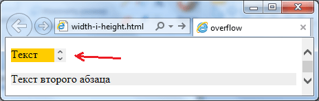
But let's now limit the height of the container using height:15px.
As a result, we got that the text no longer fits into our small paragraph container and therefore it safely ran into the area of its neighbor. This is precisely what it serves to control the behavior of content in such situations. overflow rule.
Overflow means "overflow" or, in other words, "content overflow". It talks about what should happen to the content if it does not fit within the area (container) that was allocated to it.
Overflow has several valid values, but the default is visible (show):
This is why in our last example the text of the top paragraph overlapped the bottom one (overflow:visible was used by default - show content that does not fit into the container). We could use the other extreme - overflow:hidden. Then everything that does not fit inside the container would not be shown on the web page:
The other two values of this CSS property allow you to scroll content that does not fit into the container (we already observed something similar when we studied ). So, scroll will display vertical and horizontal scroll bars even if the content fits safely within its designated container:

But it would be much more logical to use the value Auto for Overflow if you need to make scrollbars. In this case, the browser itself will calculate when to display them and on which axes.
For example, if we use overflow:auto, we will be able to scroll only along the axis where the content does not fit within the boundaries of the container:
Text of the first
Text of the second

To summarize, we can say that Overflow allows quite flexibly configure content display options in the case when it climbs out of its container. You will have the opportunity to show the content that has left (visible), not show it (cut it off - hidden), or make it mandatory to scroll (scroll) or scroll as needed (auto).
There are also variants of writing this rule related to CSS3, but which are supported by all browsers, which means they can be safely used. I'm talking about the overflow-x and overflow-y options, which allow you to set or not set scrolling on individual axes (x - horizontal, y - vertical).
If, for example, you need to make sure that horizontal scrolling never appears, and vertical scrolling appears only when necessary (if the content does not fit), then for the Html element you will need to specify overflow-x:hidden and overflow-y:auto . That's it, the problem will be solved, because this ear trick is supported by all browsers.
Height and width as a percentage - why do you need a doctype?
Now let's talk about what the width specified as a percentage is calculated from. Remember, at the beginning of the article I promised to focus our attention on this. Well, actually, the CSS width rule is no exception here and, just like padding and margin, is calculated as a percentage of the horizontal size of the content container.
The situation is somewhat more confusing with the height of the content area specified as a percentage. It would be logical to assume that the same applies to the height of the container. But here we begin to encounter dualism (two models of behavior) - as they did before and as they do now according to accepted standards. In this regard, we should once again touch upon the topic of display modes, which we discussed earlier.
Historically, after the adoption of standards, there was still a large number of documents generated according to the old rules of pure Html language and something had to be done with them. At the same time, it was also evolving (a style markup language emerged and some tags and attributes became obsolete), so it was necessary to somehow show the browser by what standards it would need to parse this code.
In order to separate new documents (which took into account all emerging standards) and old ones (which often did not take into account anything other than pure Html), Melkosoft suggested using a small feature from the XML language that had just appeared at that time. This feature was a service feature and is now called the doctype declaration.
It may look different (read more about this in the article mentioned just above), but this option will always work:
Thus, the browser received a marker of what standards it should use to parse the document. If the doctype declaration is present, then it goes into standards mode. If the browser does not find the doctype on the first line of the document’s code (or it is written incorrectly, which is identical to its absence), then it goes to the so-called trick mode(quirks mode).
A document that lacks a doctype will appear in the browser as if it were very old (antique). If you add a declaration to the same document, then the browser will shed its antiquity and begin to work with the document code according to all currently accepted standards.
But the concept of antiquity is very different. For example, how old can the now popular Google Chrome browser be, which appeared only in 2008? IE, of course, has a rather rich history. Therefore, all browsers of any version will display the document without a declaration (in quirks mode or tricks) in the same way as an old one would do, because this is the version that is considered the base one.
Why did I talk for so long about browser display modes? But because for these two modes, specifying the height of the content area as a percentage is very different in relation to the calculation of this very height.
Setting the height (in percentage) of the area with content in standards mode (when the correct doctype is specified at the beginning of the document) will not be possible at all unless the height for the container in which this content is enclosed (specified by you in percentage height will be ignored).

If we remove the doctype declaration from the document code, we will see the following picture:

For the mode of following standards (a declaration is written at the beginning of the document), you must first set the height of the container (in our case, for a Div, the container will be the Body tag) and only then the browser will correctly handle height:100%:

As a result, we ended up with two completely different approaches when setting the height of the content area as a percentage, so to avoid problems, I definitely advise you to specify the correct doctype declaration at the beginning of all your documents (web pages). There is another example where the difference between the mode of following standards and the mode of tricks will be colossal.
If you set the height and width for the content area for any Html element, and also specify the padding and border width for this tag, then in quirks mode (without a written declaration) in different browsers this everything can be interpreted in different ways.
In the old IE 5.5 browser, the padding and frame width will count inward from the dimensions specified through height and width. Those. the overall size of the element will match what is set in these CSS properties (this is a legacy scheme that is no longer used).
In other modern browsers, the padding and border width will be added to the sizes that were specified in height and width. Those. in this case (trick mode without doctype), the initially specified dimensions of the content area will be expanded by the amount of internal padding and border.
Well, if you write a directive in the document, then in absolutely all modern and old browsers these problems with the duality of the approach can be easily avoided. In this case, and in IE 5.5, the padding and border width will add up to the content area dimensions, as required by modern CSS standards. Therefore, to avoid always use doctype.
Good luck to you! See you soon on the pages of the blog site
You might be interested
 Position (absolute, relative and fixed) - ways to position Html elements in CSS (rules left, right, top and bottom)
  Float and clear in CSS - block layout tools
 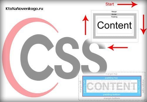 Padding, Margin and Border - set internal and external padding in CSS, as well as borders for all sides (top, bottom, left, right)
  Positioning using Z-index and CSS Cursor rule to change the mouse cursor
  What is CSS for, how to connect cascading style sheets to an Html document and the basic syntax of this language
  Tag, class, Id and universal selectors, as well as attribute selectors in modern CSS Different styling for internal and external links via CSS
  Priorities in Css and their increase due to Important, combination and grouping of selectors, user and author styles
  Display (block, none, inline) in CSS - set the display type of Html elements on the web page
  Dimension units (pixels, Em and Ex) and inheritance rules in CSS
Hello, dear reader.
This is the eleventh lesson in learning CSS. In this lesson we will look at just two simple but important properties. These properties control the height and width of the block.
Before studying this lesson, go through the previous lessons:
Theory and practice
In the last lesson we looked at what the block model is, internal and external margins. In this we will look at only two properties: the height and width of the block. Height in CSS is set by the property height , and the width is the property width . Let's take a look at the code using a real example (let's take an example from the last lesson):
| 1 2 3 4 5 6 7 8 9 10 11 12 13 14 15 16 17 18 19 20 21 22 23 | <html > <head > <title > home</title> <meta http-equiv = "Content-Type" content = "text/html; charset=utf-8" > <link rel = "stylesheet" type = "text/css" href = "style.css" > </head> <body > <div id = "content" > <div class = "firstPar" > <p> Aliquam malesuada tellus justo, eget lacinia nunc rutrum a. Phasellus dictum tempor eleifend. Nunc ut magna non purus fermentum egestas ac eu nulla.</p> <p> Fusce est tellus, mattis quis nisl et, egestas posuere libero. Donec scelerisque tellus porttitor massa dictum pulvinar.</p> </div> <div class = "secondPar" > <p> Cras</p> <ul > <li > amet condimentum</li> <li > aliquam volutpat</li> <li > elementum interdum</li> </ul> </div> </div> </body> </html> |
And in CSS for each block
Let's see how it looks in the browser:

As you can see, we have set a certain height and width. If we set the height to be smaller than the text fits, then the text would extend beyond the block. Experiment with height and width. At first it will be difficult to determine the required size in pixels by eye, but over time you will get used to it.
This is a small and simple lesson. Try resizing the block yourself and see what happens. Practice is the fastest way to learn anything!
Hello, dear readers! Today we will look at how to set the size of block elements on a web page using CSS properties and configure the display of content if it does not fit in the element.
width and height - width and height of elements in css
Using the width and height style attributes, you can set the width and height of block elements, respectively:
width: auto|<ширина>|inherit
height: auto|<ширина>|inherit
As values, you can use any units of measurement available in css - for example, pixels (px), inches (in), points (pt), etc.:
p (width:200px; height:150px)
In addition to absolute units, you can set the relative size of elements as a percentage. In this case, the width and height of the element will depend on the width and height of the parent element. If the parent is not explicitly specified, the dimensions will depend on the browser window.
div (width:40%;)
Auto leaves control of element sizing to the web browser and is the default value. In this case, the dimensions of the element will be such that it completely fits all its contents.
Let's look at a few examples.
Welcome to our automotive website. Here you will find many interesting and useful articles about cars, their technical characteristics and features.
Result:
In this example, we created a div and nested a paragraph p with text inside it. For the div, we strictly set the dimensions to 300 by 300 pixels. The p element has width and height property values equal to auto, so as you can see in the screenshot, its width is set equal to the width of the parent element, and its height is such that it fits all the text contained in the paragraph.
Now let's change the css settings for paragraph p and set fixed dimensions:
Layer2 (
background: #eee;
width:250px;
}
Result:

As you can see, the width of the paragraph has become narrower and equal to 250 pixels, and its height has increased so that the text fits, since the height parameter remained equal to auto.
Now let's set the height and width of the paragraph in percentages:
Layer2 (
background: #eee;
width:50%;
height:50%;
}
Result:

As you can see in the picture, the width of the p element has become equal to half the width of the div element. And the height increased and became equal to 75 percent of the height of the div.
When specifying the width and height of any elements in relative units, you may need to specify the minimum and maximum possible sizes. After all, for example, when resizing the browser window, the dimensions of the element can decrease and increase to such a size that the readability of the site becomes very low.
You can define the minimum width and height using the min-width and min-heigh attributes:
min-width:<ширина>
min-height:<высота>
Similar style attributes max-width and max-height allow you to set maximum sizes:
max-width:<ширина>
max-height:<высота>
It is clear that when setting the maximum and minimum values for height and width, the dimensions of the element cannot become greater than the maximum and less than the minimum values.
It is worth clarifying that the task height and width parameters only make sense for block tags, since for inline elements these parameters are not processed by the browser.
It may happen that when setting rigid parameters for the height and width of an element, the content it contains may not fit into the limited area.
For example, let’s reduce the size of paragraph p from the examples discussed above to 100 pixels:
Layer2 (
background: #eee;
width:100px;
height:100px;
}
Result:

As you can see, the text has gone beyond the boundaries of the paragraph and it doesn’t look very nice. To avoid such situations, there is a CSS rule - overflow.
Overflow parameter for hiding (hidden, visible) or scrolling (scroll, auto) content
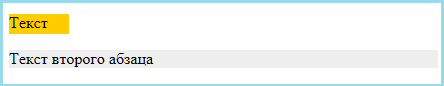
Content overflow can occur when both the width and height of an element are constrained. Let's look at two paragraphs:
First paragraph text
Second paragraph text
Result:

Since neither the width nor the height for paragraphs are specified, the browser independently calculates them based on its own understanding of the value of auto. As a result, the paragraphs took up all the available space in width, and in height in accordance with the content they contained.
Now let’s limit the width of the first paragraph:
First paragraph text
Second paragraph text
Result:

The width of the paragraph was expectedly reduced, and the height was set to accommodate the entire text.
Well, now let’s limit the height of the first paragraph:
First paragraph text
Second paragraph text
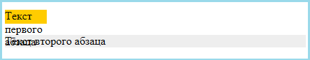
As a result, it turned out that the text did not fit into such a limited paragraph and therefore it ran into the area of the lower neighbor. Accordingly, it is practically impossible to read the text in either the first or second paragraphs. It is to control the behavior of content in such situations that there is overflow rule:
overflow: visible|hidden|scroll|auto|inherit
By default, overflow is set to visible, which tells the browser to display content that does not fit in the container. The result can be seen in the example above.
The rule hides everything that does not fit in the container:
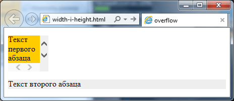
The scroll value will display vertical and horizontal scroll bars on the element even if all the content fits:
First paragraph text
Second paragraph text
The most popular and logical solution if you need to make scroll bars for a container is the value auto. In this case, the browser itself will determine when and on which axes it should display scroll bars:
First paragraph text
Second paragraph text
Result:
To customize scrollbars, you can also use the overflow-x and overflow-y style attributes, which allow you to customize the display of scrolling on individual axes. Thus is responsible for horizontal axis, and for vertical axis.
Therefore, if, for example, you need horizontal scrolling to never appear in a paragraph, and vertical scrolling to appear only when necessary, then just write the following css rule:
p(overflow-x:hidden;overflow-y:auto;)
And the problem will be solved.
That's all. Until next time. Don't forget to subscribe to blog updates and I will be grateful if you use the social network buttons.
By default, block elements use autowidth. This means that the element will be stretched horizontally exactly as much as there is free space. The default height of block elements is set automatically, i.e. The browser stretches the content area vertically so that all content is displayed. To set custom dimensions for an element's content area, you can use the width and height properties.
The CSS width property allows you to set the width of the element's content area, and the height property allows you to set the height of the content area:
Note that the width and height properties determine the size of the content area only; to calculate the total width of a block element, you need to add the width of the content area, the left and right padding, and the width of the left and right border. The same goes for the overall height of the element, only all values are calculated vertically:

For this paragraph, we will set only the width and height.
This paragraph contains, in addition to width and height, an inner padding, a border and an outer padding.
Try »
The example clearly shows that the second element takes up more space than the first. If we calculate using our formula, then the dimensions of the first paragraph are 150x100 pixels, and the dimensions of the second paragraph are:
| Overall height: | 5px | + | 10px | + | 100px | + | 10px | + | 5px | = 130px |
| upper frame | upper indentation | height | lower indentation | lower frame |
that is, 180x130 pixels.
Element Overflow
Once you have determined the width and height for an element, you should pay attention to one important point - the content located inside the element may exceed the specified block size. In this case, some of the content will go beyond the boundaries of the element. To avoid this unpleasant moment, you can use the CSS overflow property. The overflow property tells the browser what to do if the content of a block exceeds its size. This property can take one of four values:
- visible - the default value used by the browser. Setting this value will have the same effect as not setting the overflow property.
- scroll - adds vertical and horizontal scroll bars to an element.
- auto - adds scroll bars if necessary.
- hidden - hides part of the content that extends beyond the boundaries of the block element.
