Reading time: 21 minutes Images: 72
As you know, advertising is the engine of progress. But the first thing that catches your eye in any advertisement is trademark, or the logo of the advertised company. The logo is exactly what is remembered, what attracts attention and what is least forgotten. A logo is one of the main visual elements that reflects the value and quality of the brand, conveys its positioning for target audience. The logo is often called a silent salesman, a kind of shop window, but in reality its loud voice is heard everywhere. By acquiring a corporate identity, and a logo in particular, the company already acquires a new value, the impact of which on the business is undeniable. A logo is a foundation, laid in a timely manner, that contributes to the development of the brand, just as the corporate style as a whole creates the basis for the company’s promotion in the market. The logo is perhaps the most important element of a company's corporate identity. A logo is the visual identification of a brand.
Where do you start developing a corporate identity? The first stage of creating any corporate identity is, of course, the development of a logo, or the main graphic brand of the company (brand image). One of the key aspects of logo design is color coding. The correct choice of the appropriate color scheme is important for positioning the brand in a competitive environment. Development of a corporate graphic logo, within the framework of the approved brand strategy, is a creative multi-stage process. The graphic image of a brand can be in the form of: a graphic writing of a naming - a descriptor, a graphic object - a symbol, and a combined one - a combination of a symbol and a descriptor. A logo always performs two functions at once: on the one hand, it defines and distinguishes a product in a competitive market, on the other hand, it connects the product, its name and its image into one whole.
The logo is developed on the basis of positioning, creative concept, naming and becomes the face of the brand, the basic unifying element of its image. The logo is designed to separate, or more correctly, distinguish the brand from competitors, to focus and create recognition of the brand image for the end consumer in visual communications. the main task when developing a logo, the goal is to convey the main idea of the brand through an original, clear graphic image. Typically, in the process of developing a logo, the joint work of specialists is used: analytical, marketing and creative. The logo is the personification of the brand and the starting step towards building trust between the consumer and the brand. As they say, a successful logo is worth a thousand names.
The logo design should be as simple as possible, as easy to understand as possible, but at the same time have originality and creativity. All details of the logo should look complete and harmonious. Logos are usually created in vector. The good thing about vectors is that such logos, if necessary, can be reduced or increased in size without losing any elements. Vector logos are great for scaling.
Below I invite you to look at professionally designed logos. If you're looking for inspiration to create some great new logos, you'll certainly find it in this collection.
1.Matchwing
source
2.DoddieCall.Ca
source
3. Good

source
4. Wowcha

source
5.Illuminarty Creatives
source
6. Merry Christmas logo

source
7. Raindeer
source
8. Creator
source
9. Burn Music Studio
source
10.Autodetailer

source
11. Avivo
source
12. Coastal Gardens

source
13. Techie Talk

source
14. Golden Goal
source
15. Moss Creek Lumber

source
16. Genki Pilates Fitness

source
17. Mi Creative Studio
source
18. Mustachioed and Stripes
source
19. Diaz Servei
source
20. Blue Moon Market

source
21. Zoomaniya

source
22. Rumble on the Waterfront
source
23. USAsphalt Maintence
source
24. Tutti i fiori

source
25.Handbrela

source
26. Hoo

source
27. Tutti I Fiori

source
28. Magic Ghost
source
29. Hampton Rustic
source
30. Napoleon
source
31. Perpa Spor Center

source
32. Catch Record Release

source
33. Modato

source
34. Maximum

source
35. New Republic
source
36. Rey

source
37. Tribal Travel

source
38. Simon's Portfolio

source
39. Where I Ride

source
40. Tranton
source
41. Lion

source
42. Telezoo

source
43. Chief Sitting Book
source
44. Jenny Semenova

source
45. Milford
source
46. First Toy
source
47. Royalnova

source
48. Chameleon Chili Sauce
source
49. Marilips

source
50. Nirvana
source
51. Whirl

source
52. Frog Burger

source
53. Roundel Motorcars

source
54. SP Lernwelt

source
55. Hmmbird Design
source
56. Music Skull Records
source
57. Cseke Eszter
![]()
source
58. Anakonda

source
59. Kolekcja Wrazen
source
60. Mammo
source
61. Blossom Photo

source
62.ESB
source
63. Good Night TV

source
64. Rocket File

source
65. Recipe Bot

source
66. The Cleaning Corps
source
67. Remitek Logo Design

source
68. Chalk & Talk Logo

source
69. Performyourbest

source
70. MAZ Logo

source
71. Spice Kitchen
source
72. Force Lacrosse
source
When it comes to your business's branding strategy, creating a company logo is one of the most important and responsible tasks.
This is understandable: this image is used in all your marketing campaigns (both online and offline), and a simple logo will be one of the most memorable brand elements.
Your logo should be interesting, easy to understand, consistent, and strongly associated with the company name in the minds of your target audience, and the best logos in the world meet these requirements. Unfortunately, marketers of many world-famous companies lost sight of the very simple principles listed below, which subsequently led to the need to redesign the logo, financial losses and loss of loyalty of the target audience.
Let's look at the best logos and try to understand the reasons for victories and defeats 12 famous brands who have ever resorted to a “logo change operation” in their history, and find out which logos sell better.
1. KFS logo (Kentucky Fried Chicken) - redesign and successful launch of a marketing campaign
In 2006, the Kentucky Fried Chicken (KFC) restaurant chain launched a new logo - the chain's famous mascot, the dashing "Colonel Sanders" (the one depicted in the KFC logo) changed his chef's apron from the traditional white to red. You might say with a grin, “Well, that’s a big deal!” But for KFC, redesigning the logo, which had not changed for decades, cost a significant amount of money.
Why did KFC management decide to change the usual visual image of their brand? The company's press release explains this as follows: they wanted the image of the colonel to become "more expressive and clear, more visually aggressive." And the same press release goes on to say that “the updated logo demonstrates our culinary passion and our commitment to cooking and serving Colonel Sanders' famous chicken recipe to consumers.”
However, the real revolution in KFC marketing came when, in collaboration with the PR agency Synergy Events, they placed an image of Colonel Sanders in the Mojave Desert wearing a new red chef's apron, laid out from 65 thousand square tiles measuring one square foot each. Now the Kentucky Fried Chicken logo, one of best logos companies of the world, visible from space.

KFC's successful experiment can serve as an inspiring example for any marketer: they took a familiar (already canonical) image used as an easily recognizable logo as a basis, then made it even more attractive, thereby strengthening its symbolic meaning. And, of course, we shouldn’t forget about the costs of viral marketing. :)
2. The Gap logo redesign and its disastrous consequences
In 2010, someone at Gap decided it was time to change their brand logo to a more modern version. The result of this sudden decision was the appearance of a new logo. Alas, the largest clothing manufacturer was subjected to a barrage of negative criticism in in social networks. Thousands of angry fans of the brand published an image of the old familiar GAP logo on their pages and blogs as a sign of protest.

It’s sad, but no one reminded GAP management of the old proven wisdom: “If something works properly, then don’t fix it!” The brand's clients were in highest degree loyal to the original logo.
Remember! Web marketers shouldn't make decisions as important as logo changes based on their own assumptions—creating a focus group of your usual target audience will help you look at the redesign from a different perspective, through the eyes of the consumer of your product. In addition, no one stopped GAP marketers from conducting a good old fail-safe survey aimed at comparing the reaction of the target audience to the old and new option logo
3. Apple as an example of the perfect rebranding
A list of examples of the best logos cannot be complete without biting into an apple. Today we think of the Apple logo as “simple, yet stunningly elegant.” But this is not the first version of the Apple logo. What was the logo for this campaign? The logo originally featured Sir Isaac Newton sitting under an apple tree. A little later, the logo was an apple painted in “7 colors of the rainbow.” And finally, the logo evolved into the simple emblem we know and love today.
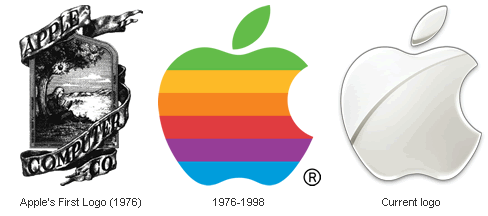
The experience of redesigning the Apple logo clearly demonstrates what a symbol of any company should be: the logo should be simple, understandable and beautiful. (The history of logo changes, as well as all the ups and downs of this unique company, is described in the biography of Steve Jobs).
4. Google: Successful Rebellion Against Conventions
Surprisingly, the Google logo actually openly violates several standard rules of branding and lightweight logo design. He uses colors that seem to "contradict" each other. The letters that make up the brand name cast small shadows, which also goes against all the rules of creating a modern logo. The use of a serif font is also very rare in the graphic embodiments of relatively new and recognizable brands.

However, almost all offers from Google have fantastic branding, and the unusual design of the brand logo only emphasizes its difference from competitors. In addition, the best logo designers have worked to ensure that the logos of different Google products are very similar to each other, which helps to reinforce in the consumer's mind that all these things are sometimes very bad. similar friend different in purpose and functionality - the products are manufactured by the same brand.
5. Pixar: "Jumped out of the box" to match itself with the best
In 1986, one of the first opuses of the Pixar studio, the short film “Luxo, Jr.”, was released. It was this animated film that inspired the creators of the studio's logo: the letter "I" in the word Pixar looks exactly like the cute character of this cartoon - a "living" table lamp named Luxo Jr. An animated version of the logo appears at the beginning and end of most Pixar films, and Pixar fans absolutely adore it.
The most important lesson any marketer can learn from reviewing the Pixar logo is that if you create and then market something that people love and admire, you will be remembered.
6. Starbucks - logo embarrassment
The Starbucks logo has always featured the words “Starbucks Coffee” around an image of a two-tailed mermaid. The inscription helped those who see the company logo for the first time to understand the meaning of Starbucks' activities.
However, in 2011, Starbucks updated their logo - they got rid of the words and left only the mermaid design, apparently hoping that their brand recognition was already strong enough.

However, it seems logical that, no matter how widely known the company is, there will still be people who do not know your brand or brand, and in their minds a two-tailed mermaid is not clearly associated with coffee. The inscription on the Starbucks logo was clearly not out of place.
7. FedEx - “two birds with one stone!”
The FedEx logo is one of the best, truly ingenious, but few will understand why this is so.In fact, the FedEx logo represents much more than the purple and orange company name. Please note: inside the logo there is a black arrow, invisible at first glance, symbolizing the speed and reliability of the courier service.
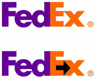
The FedEx logo is a great example of a simple, easy-to-remember logo that clearly communicates its brand mission. Try to create logos that have dual meaning (such as the FedEx logo) - this great way stand out from your competitors and highlight the value of your offer.
8. Pepsi is the most boring logo ever.
Over the past hundred or so years, the Pepsi logo has changed quite often. Quite recently, the company name completely disappeared from the logo, leaving all the meaning to the obscure image of the ball.
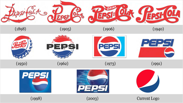
Most of the feedback the new logo received went something like this: “The logo shows a swollen belly!” Agree, this is not the best branding for a company that claims that its drinks are healthier than those of its competitors.
Pepsi's new logo received a lot of negative imagery, in no small part because consumers compared Pepsi's new "bloat belly" to Coca-Cola's immaculately elegant logo.
Remember! To avoid making bad logos, listen to your target audience to find out how they see your brand, and then use inspiration to create a logo that matches that “dream brand”!
9. Amazon.com - the hidden meaning of the brand
Amazon.com has created such a recognizable brand that if a user needs a product, he will most likely go to the Amazon portal first. Amazon.com certainly has very strong branding, but they also have a great logo: the arrow in the logo that goes from the letter "A" to the letter "Z" in the word "Amazon" symbolizes that " All goods are sold here, from the letter “A” to the letter “Z”. And, of course, this arrow resembles a friendly smile.
![]()
The Amazon logo was designed in full compliance with the two great rules of design. Firstly, the logo carries an additional meaning that clearly states the main purpose of the brand: “we have created a web resource where people can find any products they want to buy online.” Secondly, it is a simple logo that will not cause any ambiguity or negative interpretations among clients. Web marketers should always remember these two main rules for creating a successful logo.
10. Animal Planet - openly poor redesign
The Animal Planet channel marketed itself as "the place where people learn about animals." The redesigned logo no longer reminds us of the content of the channel: the creators of the emblem got rid of the memorable silhouette of an elephant, replaced by an extravagant letter “M”, strangely “laid on its side.” Here is an example of an epic failure, equivalent only to the aforementioned “Gap disaster”: recognizable branding was completely destroyed. The key image of the elephant disappeared, replaced by the ridiculous letter M.

Animal Planet once had a great, fun, and clear logo that fit the purpose of the popular science channel. The new logo makes us want one thing: to repeat the proverb that you don’t need to fix what isn’t broken.
11. MTS: “The egg becomes voluminous.” What for?
Judging by the rating compiled in January 2011 by Interbrand, in 2010 the operator cellular communication MTS had the most valuable Russian brand. MTS was apparently doing so well that year (in other words, “there was nowhere to put the money”) that on October 1 of that year, MTS Vice President for Commerce Mikhail Gerchuk told the general public literally the following: “Updating the logo and corporate identity style is one of the tasks that we are solving as part of the implementation of a new positioning of the MTS brand...
It is important that when updating the logo, we were able to give a new meaning to the already familiar symbol and image of the company, while making the logo and style more relevant in graphics and freer in composition.”
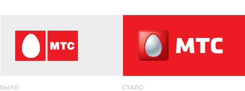
On online forums of professional designers, this “redesign” was met with a barrage of derogatory remarks, the most decent of which sounded something like this: “The same eggs, only in profile, that is, in 3D.”
The verdict of the Russian design community was harsh but fair (hereinafter quoted): “Designers found the Layer Properties menu in Photoshop! Progress! First, Sberbank played with inner shadow, now MTS with external light.
And as it was, it remains so.”
Let us note that the redesign of the MTS logo was not done by a random person on the street or by the eighth-grader nephew of one of the company’s top executives. New version emblems of the largest Russian operator mobile communications developed in the Moscow branch of the most authoritative international advertising agency BBDO Branding.
“...And as it was, so it remains.”
12. Sberbank of the Russian Federation: “Russian redesign is senseless and merciless”
A year earlier, the leaders of Sberbank of the Russian Federation decided on a similar operation. According to independent experts, the redesign of the logo cost the “main bank of the country” at least 20 billion rubles (the external and internal design of more than 20 thousand Sberbank branches had to be changed). The modification of the emblem boiled down to what was already quoted above: “...Sberbank played with the internal shadow.”

However, the same experts wrote openly: “These costs will be justified only if, simultaneously with the change of image, the bank completely restructures its business processes.” But Sberbank is in no hurry to fulfill this condition to this day.
The message about the logo redesign at one time caused a serious “seething of waves” in the RuNet: in extremely expressive terms, indignant clients advised Sberbank management to spend money more in a rational way- for example, send all bank service personnel to courses in good manners.
Huge amounts of money that resulted in subtle and pointless changes to a terrible logo - like this on this moment and it looks like the Russian version of what is called a redesign of the brand emblem.
This is what company logos look like, simple and complex. We hope, dear friends, that our new post will be interesting and useful for you.
High conversions to you!
Each of us sees these logos every day, but not everyone understands the secret meaning contained in them.
So, it's time to expose the logos that flash before our eyes every day!
If you think that the logo of the Korean titan Hyundai symbolizes the first letter of its name, then you are deeply mistaken! H is a symbolic image of a client and a customer shaking hands.
Who hasn't heard of the Adidas brand? It was formed in honor of its founder, Adolf Dassler. The logo was endlessly changed, leaving only one element untouched - the three stripes. The modern logo is depicted in the form of a mountain. This is a symbol of the obstacles that every athlete is sure to face.
Renowned designer Rob Yanov, who worked on the Apple logo, bought a bag of apples and frantically drew them, trying to make the shapes as simple as possible. A piece of apple was bitten off as an experiment. Oddly enough, the word byte is translated as bite. What a coincidence!
Sony Vaio has an extraordinary logo. Its first two letters are wave, which represents analog signal, the last two letters symbolize a digital signal.
There's nothing fancy about the Amazon logo. The bright yellow arrow is the customer’s smile, because Amazon employees wish their customers happiness. The smile arrow combines two letters A and Z. This means that you can purchase everything on the portal – from A to Z!

Baskin Robbins has a bright and, one might say, appetizing logo. If you look closely at the pink part of the picture, you can see the number 31. This is the number of ice cream flavors customers can try.
Many people believe that the Toyota logo is a stylized head of a cowboy in a hat. But everything is much more complicated. In fact, it shows the eye of a needle and the thread threaded through it. The thing is that the company used to deal with weaving machines. There is one more subtle nuance - if you put all the elements of the logo together, you get the name of the company.

Continental produces car tires. One of them became two in capital letters logo. If you look closely, you can see the wheel drawing in perspective.

The Formula 1 logo literally screams speed. An attentive viewer will notice the number 1 between the letter F and the red stripes.
Do you like to watch interesting video clips and pin them to your online board? The inventors of Pinterest suggest “pinning” videos using a virtual needle, which is the letter P in the logo.

It's hard to believe, but Beats deciphers its logo as a music lover wearing headphones. The logo contains two elements - the letter B and a red circle... Simple and incomprehensible!
Toblerone is a world famous manufacturer of delicious chocolate. This brand is inextricably linked with the bear city of Bern. That is why the Toblerone logo depicts a bear standing on its hind legs.
BMW began its history in the aviation industry, so the logo speaks about this. Some believe that in the center of the logo is a moving propeller with blades. But no, everything is very simple, this is just part of the Bavarian flag.

In the center of the LG logo is a smiling man. Because the company’s employees treat their customers humanely, which they want to emphasize. Some skeptics believe that the company's logo is based on the Pac-Man character.

Evernote employees are confident that some animals remember information as well as humans. That's why they put the logo of an elephant on their logo, which has a slightly curved ear, like paper. With such an elephant - a note from Evernote, the user will not forget anything!

The hidden meaning of the Coca-Cola company is amazing! To increase sales in Denmark, they placed the Danish flag in the space between the O and L.
2 March 2017 14:00
The most beautiful logo in the world. Worldwide recognition of the Ajax emblem
A popular British magazine recognized the Ajax logo as the most beautiful in the world. Sport FM tells how the club got to this point.
Initially, “Ajax” was the name of two participants in the Trojan War. Ajax the Lesser was present in mythology, but the creators of the football club remembered, first of all, Ajax Telamonides, the cousin of Achilles from Homer’s Troy. However, this character did not immediately become the “face” of the club emblem.
By and large, the history of Ajax as a football club began back in 1893: it was first called “Union”, and then was completely renamed “Foot-Ball Club Ajax” - exactly that, with a spelling error. The requirements for teams were tightened around the same time, so the club lasted until 1896 and ended its history.
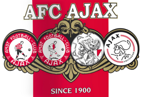
The birthday of the current Ajax is considered to be March 18, 1900 - four days before that, the founder of the club, Floris Stempel, sent a letter to his friends about a meeting at the East Indies cafe, and on Sunday morning of the 18th the decision was made to create the Football team Club Ajax. We didn’t bother too much with the logo - we placed the image of an Ajax football player in a circle and added it to everyone understandable words– where the club comes from and what it’s called. That's how they played - wearing uniforms with vertical red and white stripes and black shorts.
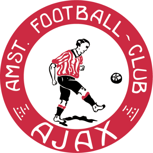
11 years later, Ajax achieved promotion to the top Dutch league and was faced with the problem of changing equipment - Sparta Rotterdam had already performed in exactly the same guise, so the newcomer, according to the rules, was forced to change something in his uniform. This is how the legendary wide vertical red stripe appeared on the T-shirt, and the panties turned white. Accordingly, the emblem also underwent a design change. But it’s very minor, they just changed the colors.
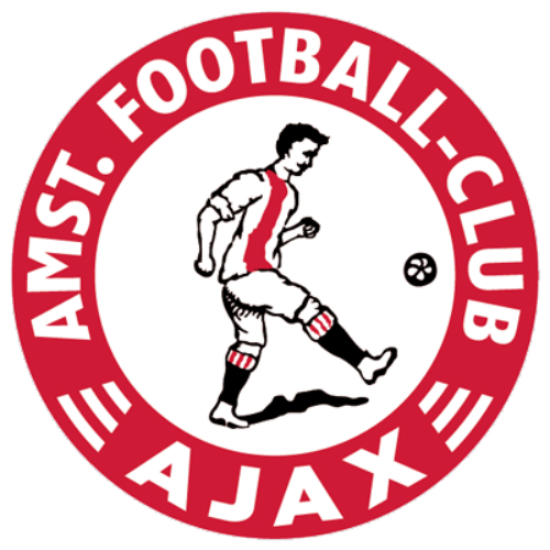
The existence of such a logo is confirmed by printed edition“Clubnieuws der A.F.C. Ajax", published in December 1916.

The team performed with this logo for nine years, but to celebrate its 25th anniversary it decided to take a radical step - to change the logo completely. Moreover, for three whole years the club’s management pondered over a new image and eventually decided on a radical change - only the round shape and the inscription with the name of the team remained from the previous one.
A drawing of Ajax's head was placed in the circle, the inscription was placed on the left, and on the right they reminded of what colors the club wears. The image was placed on a porcelain plate, and the change of emblem was officially announced on September 20, 1928 in the club news newspaper.
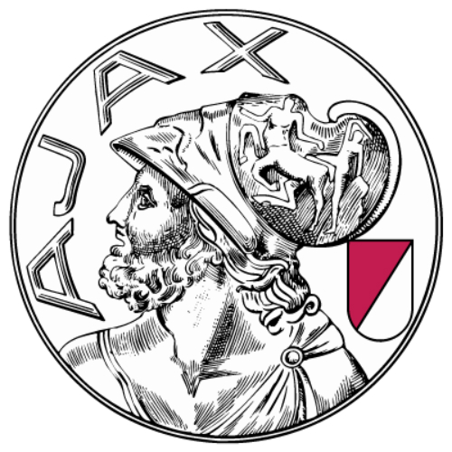
Over the years, Ajax built up its collection of trophies, and the logo became increasingly recognizable and lasted for 65 years. However, then the time came for business, and such a complex design already poorly fit into the new commercial rules - a lighter image was required that would not lose touch with the previous logo.
The development of the new logo was undertaken by an advertising agency. Indeed, the drawing was simplified to the utmost, but at the same time one feature was added here, emphasizing that the club is a football club. However, it was not possible to guess this right away, and even the experts from “What? Where? When?" could not recognize the correct version. But everything turned out to be simple: Ajax was drawn on the new emblem using 11 lines, symbolizing the number of players in one team on the field.

In 2006, fans raised the issue of changing the logo to the old one, and protests against the current emblem were very violent, but the Ajax management did not succumb to fan actions. In total, the club changed its images three times in its history, but the fourth version, the one that was adopted in 1990, remains unchanged to this day.
Ten years after these protests, controversy over the emblem has subsided, but could flare up with new strength after the publication of the ranking of the best football logos world by the popular British magazine FourFourTwo. The competition, where the Russian club CSKA also made it into the top ten, was won by Ajax. And this is how the rating compilers commented on their choice:
“When too much thought is put into a design, the real meaning of the logo is replaced by a bunch of metaphors and PR. They say the red hue signifies the club's ambitions. Or maybe he is there because the club plays in red, eh, clowns? It's not like that at Ajax. A slightly strange drawing lived for more than 60 years, until the idea came to mind to turn the warrior’s head into an abstraction. The result: intricate 11 shapes representing the 11 players on the team. Pretentious? No way. The logo of the Dutch club will be in your shower already.”
Perhaps you can’t say it more precisely.
